


Purpose

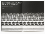
I’d just been talking about the flow and rhythm of a printed matter with my students when I stumbled across the work that Purpose did for EFFP, an agricultural and food cunsultancy company. I figure if you can make agriculture look this sexy you got something going for you, and I love seing the contrast from each spread to the next without straying from the overall identity. Great work!
See more: http://www.purpose.co.uk




Comments