


Font of the week

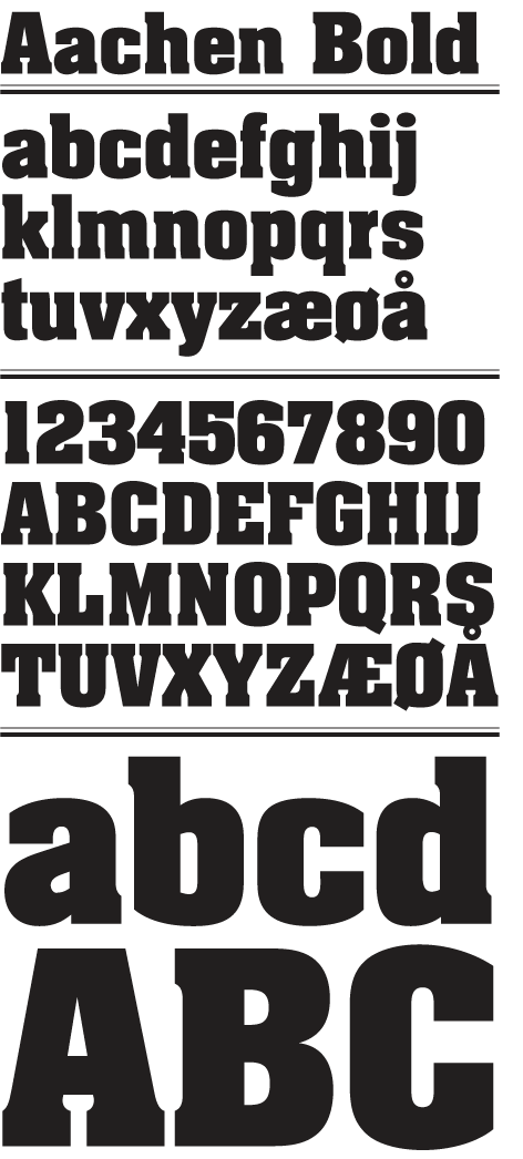
This week’s typo treat is a bit of a fat ass font. Aachen was designed in 1969 by Colin Brignall and Alan Meeks. I love this font because of it’s heavy but very short slab serifs and the minimal whitespace between letters, it looks particularly good set in a block in caps.
Buy Aachen at Linotype.

Comments