


Fiesta and Food Photography

I have been writing this blog for quite a while now and have learned a few things about the process. I’ve streamlined all of my steps in process as much as I can to fit the pace of daily posting, and while I think I generally do a decent job, there are many areas for improvement.
One of those is my photography.
I generally have made decisions around the pictures you see here for many reasons that don’t really have to do with the food.
I am often moving fast in the kitchen and some pictures end up a little blurry.
Any picture of something on the stove generally has some steam coming off of it and often causes the picture to be foggy.
I use my iPhone to take pictures. I could use a better camera, but the iPhone is always on me, is quick to operate (which can be important in the middle of cooking), and with the use of Dropbox, I can easily move the pictures off for later processing.
While I try to add as much lighting as I can (without it really being severe), the lighting in my kitchen is not the best. I don’t have any south facing windows in my kitchen (and the one in the dining room rarely gets direct sunlight due to the house next door), so I use my existing lights. With built-in floods and some under cabinet lighting, I get light, but not always the best lighting for pictures.
I shrink the pictures I post here to save space. WordPress gives you a set amount of room (for free) and for the first year I didn’t resize my photos. I quickly filled up 80% of my allotted space. Since then I’ve shrunk them. When you shrink a photo, you do lose some quality. (Since the redesign in September, I typically now have one picture a little larger than the rest, but it is still shrunk from its original size)
I don’t do a great job of organizing my pictures before I take them. For final plating, it is the plate that I eat from and the family is often sitting around the table waiting for me to be done with the picture so we can all eat.
This year I was able to go to the International Housewares Show in Chicago and while I was there, I spent quite a bit of time at the Fiesta booth. Fiesta is a collection of ceramic dinnerware made by the Homer Laughlin company that offers sets in a large variety of colors. (16 currently) and other patterns. The offer great plates, bowls, serving dishes, etc.. in some really interesting and unique colors.
While talking to their representative, I really started to think about how in great food photography, the dish color (and pattern) is an important component in making the whole thing look good. The people at Fiesta couldn’t agree more and to help me explore this a bit more, they sent me four dinner plates, each in a different color.

I am not unfamiliar with Fiesta, as I currently have a bunch of the scarlet colored plates and bowls (handed down to me from the Ranting Mom). Fiesta sent over another scarlet plate, lapis (their newest color), tangerine and turquoise.

Now that I had some different colors, it was time to explore. Please note that for the sets of pictures below, it was all the same dish, at the same time, with the same lighting conditions and the plate in the same place. I tried to take the picture from the same angle, so the plate color and that specific plating are the only differences.
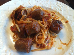
First try was a plate of pasta (whitish yellow), with some red sauce and large pieces of dark brown sausage. I brought out a white plate from an old set (not Fiesta). I thought that the white would be best as the sauce is red and that would be a great contrast, right? What happened was the sausage got washed out. The contrast was too high between the white plate and the dark sausage.

The turquoise did not work here. Look at how everything has the same color (this was a little blurry too).

The blue suffers some from the same that the turquoise had but the pasta looks a little better and there is more color definition. Still not right, though.

The scarlet is good but it doesn’t look like there is ANY sauce on the noodles.

I thought the tangerine was best. Good color definition and it looks good.
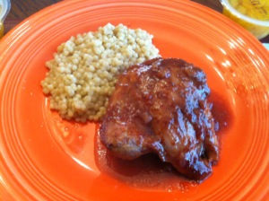
Here is another dish with the red/white combination. This looks decent, but you don’t see as much definition in the meat.

So much more color to the meat here. You can tell that tomatoes were used. I like this the best of the pair.

Here is another challenge. Pork, potato salad (more red and white) and a collection of grilled veggies with some yellow, green, red. The turquoise does not do well for the veggies.

The tangerine looks pretty good but still not enough definition in the veggies.
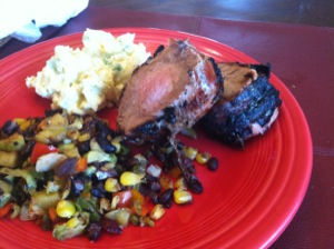
I thought this was the best of the three. While not perfect (the potato salad is a little washed out), the yellows are better.

Finally some green (edamame), white (mushroom risotto) and some brown (mushroom chicken). This works well for everything but the risotto.

The risotto still doesn’t work here but the chicken is a little more defined.

This works well for the risotto and for the rest.

This dish had chickpeas (tan), eggs (white and yellow) and spinach (green). Quite a challenge. The tangerine didn’t work for me.

The yellows worked here and the tans. The greens seemed darker.

Sometimes white still can be best.
I know I can improve my food photography and will likely go out and buy some additional colors of Fiesta to best match the dish at hand. It is a good choice for any foodie blogger. Check out the great dinnerware that Fiesta offers and as they sell individual pieces, you too can have a variety. In fact, when I now have four different colors set out on the table, it really is a great look.
All the dishes you see above will be in future posts.

Comments